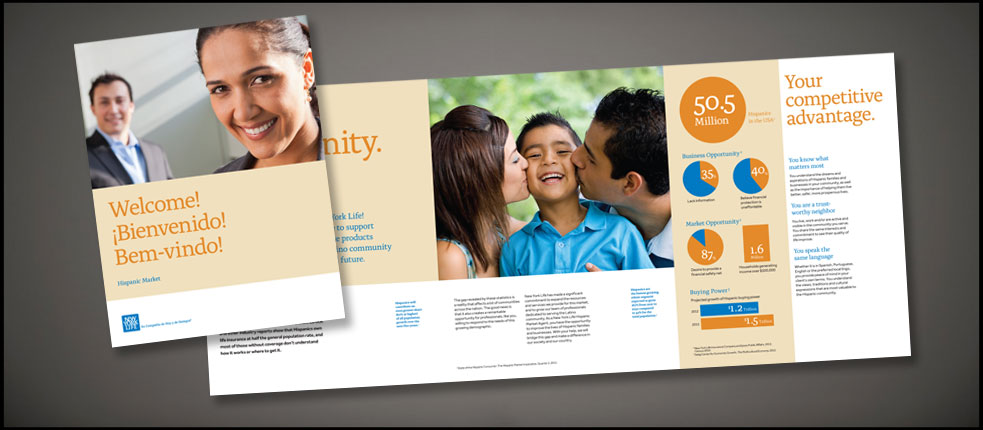
 Brochure:
 Building on the New York Life brand initiative while designing a cultural targeted information piece.
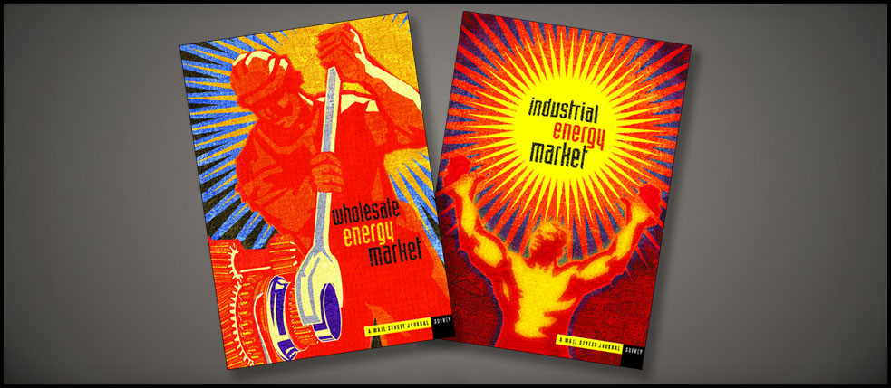 Brochures:
 Visually arresting imagery and typography was used to make these companion pieces stand out in the promotion of energy advertising for the client.
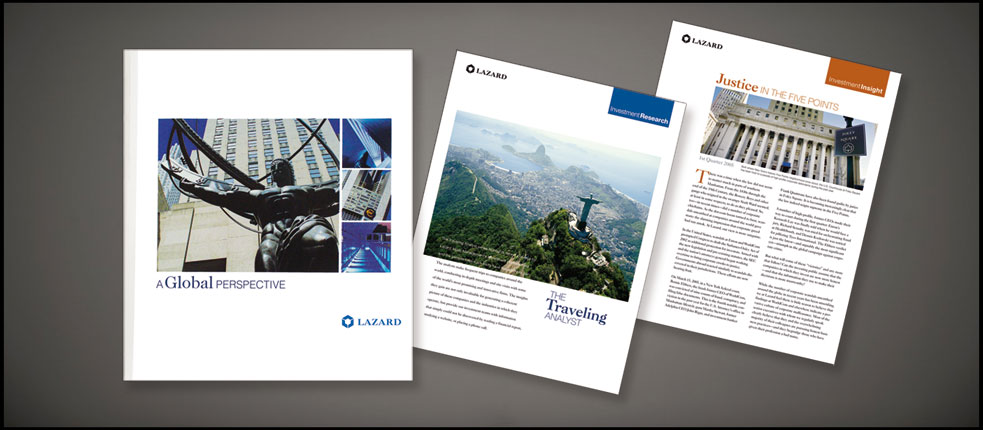 Branding:
 Utilizing color, typography and bold imagery, a look and feel was established to create a striking and quickly identifiable visual format while differentiating Lazard's numerous categories and products. Thus, translatable for use on their websites, folders, whitesheets and other promotional materials.
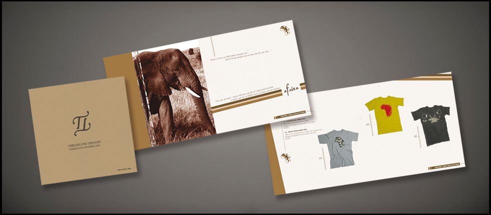 Lookbook:
 Drawing upon the environmental mission/products of the client, I tapped into color, photography and paper stock to evoke the feel of the earth.
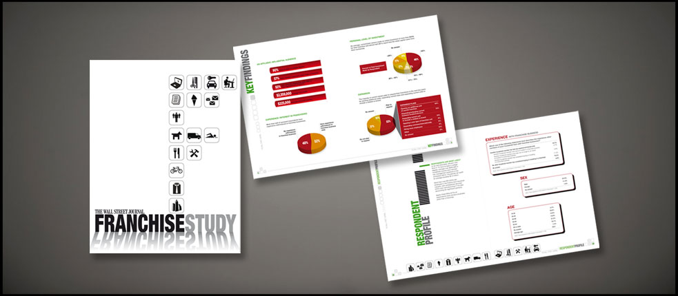 Brochure:
 Designed to speak about the Franchise industry, illustrations and color were combined with typography to create a visually stimulating piece.
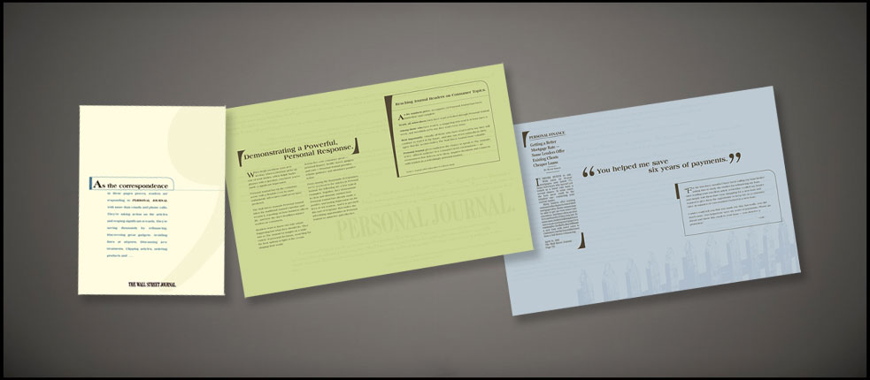 Testimonial Brochure:
 This brochure was designed to highlight testimonials from satisfied readers of The Wall Street Journal, thus illustrating the power and reach of the product.
 Placemats:
 One offs for various clients to increase new business advertising.
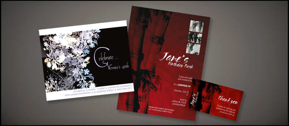 Invitations:
 Invitation A - Centering around flowers, I played with the image to create something light, airy, sophisticated and delicate with corresponding typography. Invitation B - The challenge here was incorporating Asian themes while staying away from kitsch-like sensibilities.